Eseye
Making IoT accessible
The Challenge
Eseye is an IoT provider with a global impact based in leafy Guildford, Surrey. In the runup to their Series C investment round, Eseye’s brand and communication materials were in need of an uplift with a rapid turnaround. After the success of the initial project, we embedded within their Marketing team to overhaul nearly every communication touchpoint within the business.
Services
IDENTITY DESIGN
WEB DESIGN
COMMUNICATION DESIGN
USER INTERFACE
Identity Design
Our first task was to reinvigorate the brand identity as the company started to scale.
We maintained the DNA of the original design, but ensured we had a more distinctive marque, with both increased vibrancy and legibility.
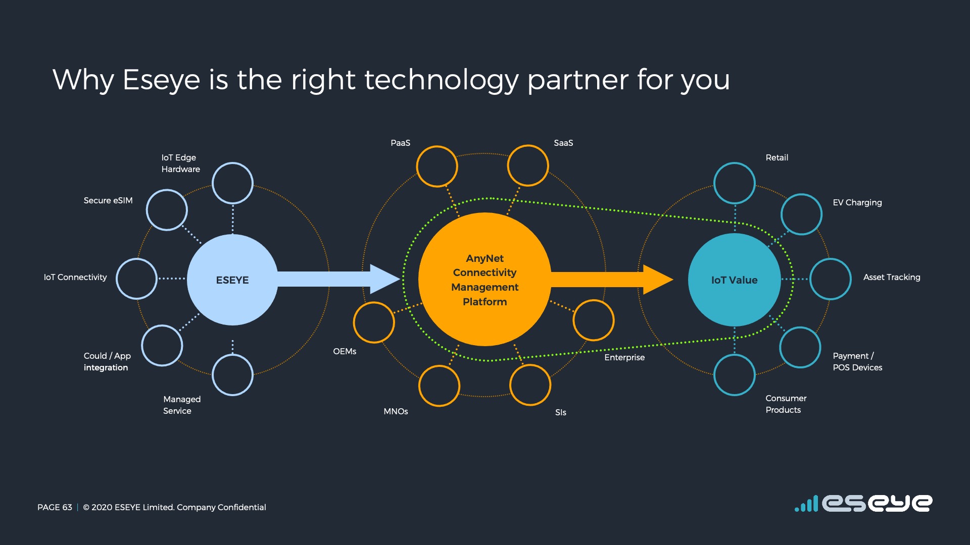
Presentation Design
With an international sales team and a very complex message, we had to ensure consistency across all our communications. We created a set of core assets, along with slides configurable for a particular client. A series of animations that pushed powerpoint limits helped to ensure we made the right first impression.

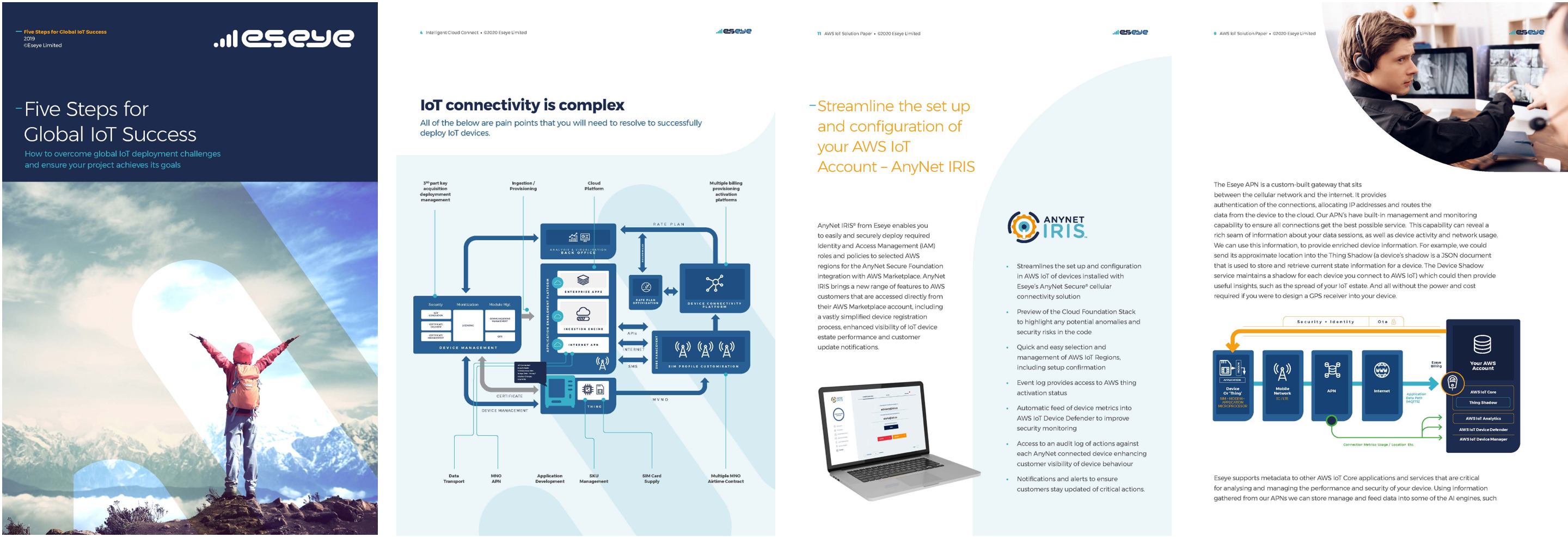
Brochures
Drawing on our experience in the publishing industry (a long story, we'll tell you later),
we created robust and flexible frameworks for physical and electronic brochureware.
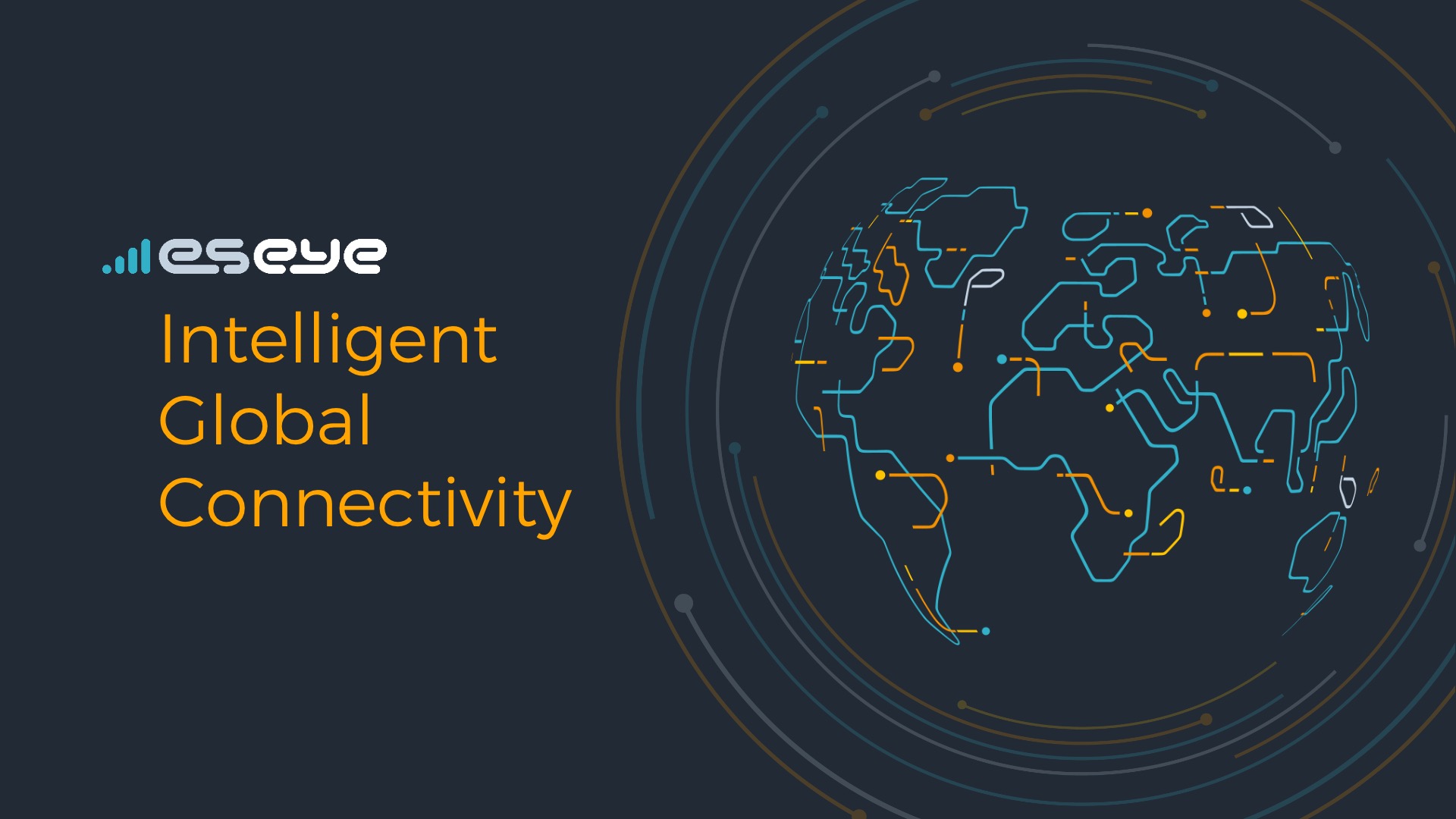
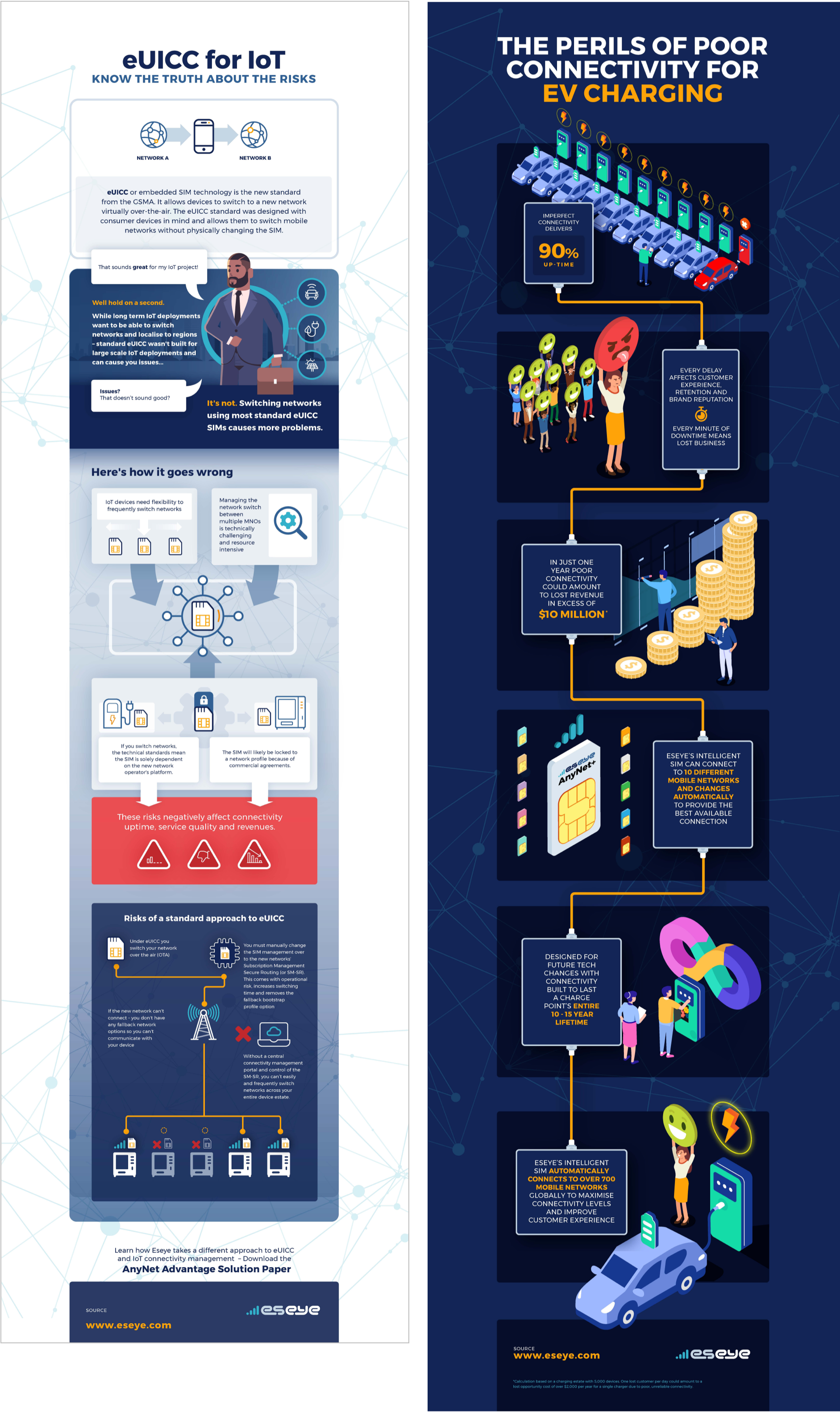
Infographics
Created for use within a targetted marketing campaign.
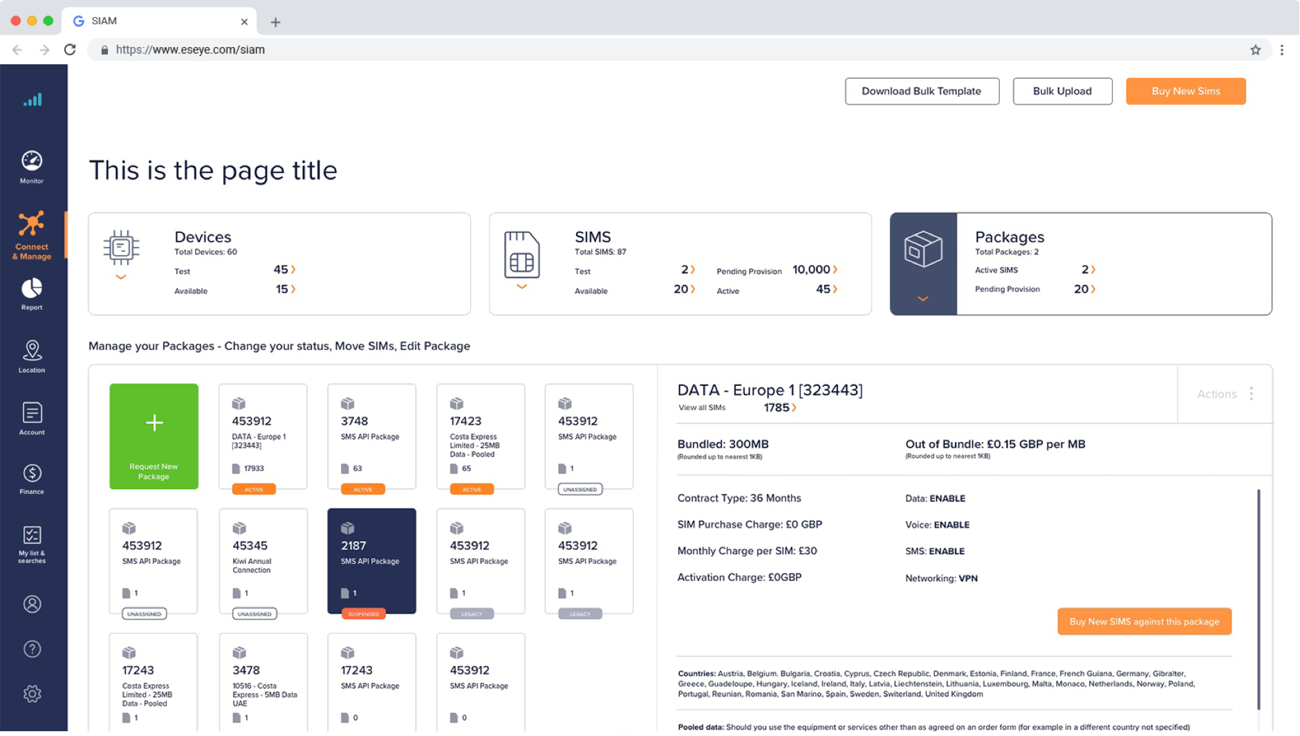
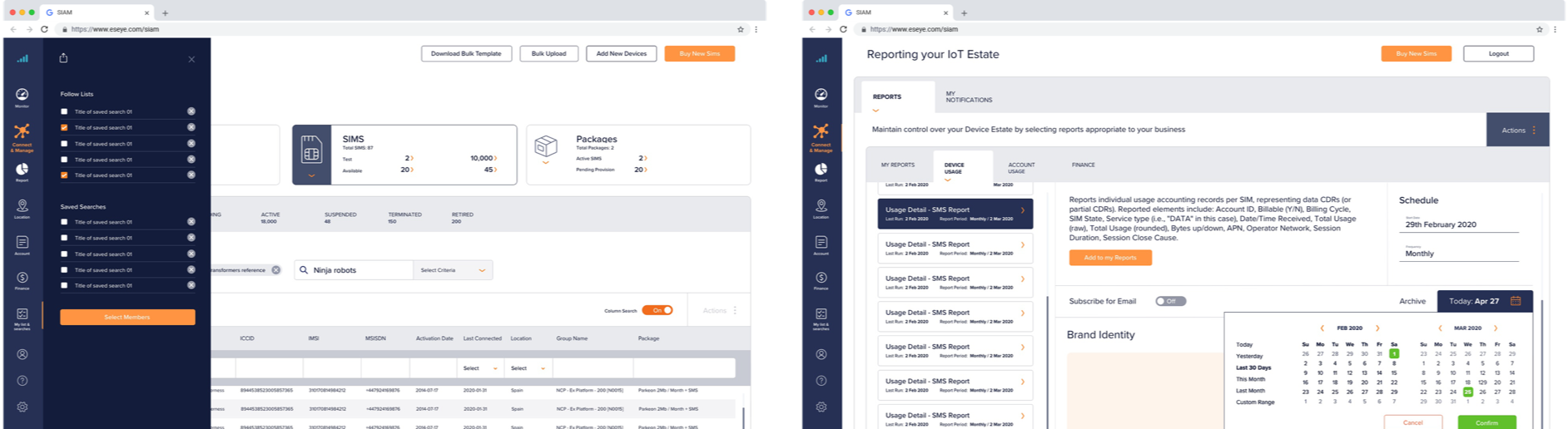
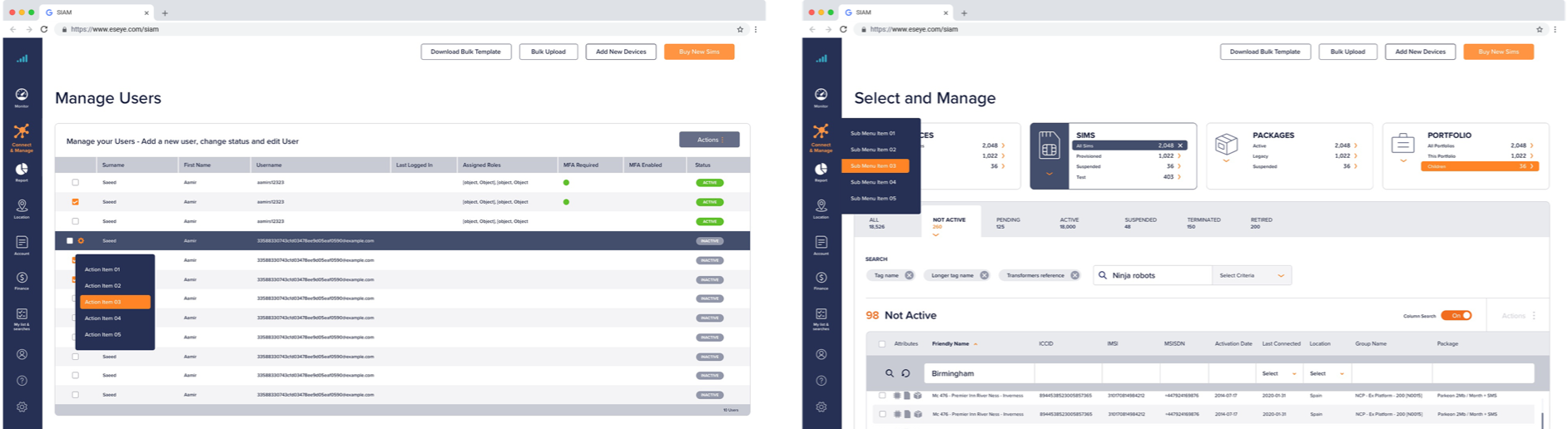
User Interface Design
A plaftorm design to allow users worldwide to manage their IoT devices, we were challenged to help create a more effective and user friendly version of the interface.